
I really enjoy The Atlantic magazine. Ever since my mother left it open on the table with a portrait of Robert Parker I've been hooked. It's well written and insightful, and I feel just that much more informed after I read it.
What's really fun is when there's a story that starts to approach my fields-- Software Development and Project Management. Although, to be honest, I know a lot more about Software Development, PM has a certain appeal since its something many more people can relate to. (Have you ever been to a party outside of a technology area and said 'I write software for a living'? Invariably, the response will be 'Cool, I've been having this problem with Word, could you take a look at it for me'). So it was a pleasant surprise when I found Matthew Stewart's article "The Management Myth" (subscription required) in the June 2006 issue.
Generally, the perception of Project Management is one of trepidation. And why is that? Is it because the tools are so woefully inadequate and hard to use? Or is it because of what Project Management represents? I couldn't help but notice when I first opened the article that the accompanying picture told a definite point of view. I couldn't find it online, but a brief description would be of a greek philosopher pacing with a stopwatch with an eye on his workers, who are dressed in contemporary clothes. The workers are not watching their screens, but instead are watching the would be greek philosopher. The message is clear: a pretentious psuedo-classic scientist who rules through intimidation and fear.
This social dynamic has, unfortunately, been set up from day one, ever since Mr. Frederick Taylor wrote (as told by Mr. Stewart):
... the science of handling pig iron is so great and amounts to so much that it is impossible for the man who is best suited to this type of work to understand the principles of this science, or even to work in accordance with these prinicples, without the aid of a man better educated than he is.
What starts as a waft of elitism culminates as a winter storm blowing a chill through the entire workplace. No wonder management theory has such a negative connotation.
And yet, people must work in groups in order to produce things. And we must measure efficiency in order to better production. Is there a way to accomplish this without reducing workers, the people most responsible for a product's quality, to pig iron schleppers? Or in todays information age, virtual pig iron schleppers? Well, a crappy PM will always be a crappy PM, but perhaps we can improve the tools so that people can understand their piece of the whole, so that people can communicate up or across production chains easier and so that people don't feel they're reduced to just a blue bar on a gantt chart.
Mr. Stewart lays out an excellent case that Mr. Taylor was indeed an unfortunate representative of a nascent management science. And I would go so far as to say it is worth re-examing the conventional wisdom of business management culture and curriculum. However, I would not throw out the baby with the bath water, for, as is commonly the case, its not necessarily the tool but the tools wielder that is the problem.
From the article:
That Taylorism and its modern variants are often just a way of putting labor in its place need hardly be stated: from the (pig iron laborers) point of view, the pig iron expirement was an infuriatingly obtuse way of demanding more work for less pay. That management theory represents a covert assault on capital, however, is equally true. (The Soviet five-year planning process took its inspiration directly from one of Taylor's more ardent followers, the engineer H.L. Gantt.) Much of management theory today is in fact the consecration of class interest-- not of the capitalist class, nor of labor, but of a new social group: the management class.
Yes, this is the same H.L. Gantt from whom the eponymous chart came. And not only was he associated with Taylor's class warfare, but he even insprired the Soviet poliburo five-year plans. One can just imagine Dr. Evil twisting his pinky at the corner of his mouth. I'll bet he even had bad breath, too. But is it possible that someone so misaligned could produce a tool we can build upon and imbue a more constructive perception?
I believe so. I think the Gantt Chart is one of the better, if not the best, tool for spatially organizing tasks on a timeline. It communicates a volume of relevant information quickly and efficiently, and, I would argue, is intuitive enough that a pig iron schlepper-- even a virtual pig iron schlepper-- can make sense of it. The trick will be to
1) Detach it from its ignominious history
2) Improve peer communication
3) Improve management communication
And, in truth, this isn't just a task for the Gantt Chart, but in fact for all project management tools. And I have a simple philosophy to make it happen: remember that people cannot not be reduced to blue bars.
Here's what we can do:
1) Project Management is about communication, so take a cue from communication apps like Instant Messaging (online presence, signatures, personalization)
2) Allow people to use avatars next to their assignments (more personalization, express moods, real photos)
3) Allow people to customize the task and milestone icons (if you're producing an airplane wing, wouldn't that be a cool final milestone?)
And make sure all the people assigned to each task, summary or project have their contact information and personalized representation. Provide easy means for public communication (which brings a certain amout of social responsibility), and with individuals via instant messaging for more private communication (which brings a certain amount of social connection).
In short, maintain much of the current project management time and cost information so that management can evaluate results, but add the social tools so that management, and the workers, can also evaluate the process itself. Anytime a group of people get together, it is fundamentally a social event, whether they are producing a bottle of beer or drinking it. Part of the fun of being human is knowing how to evaluate social events.
Up to now, Project Management has not dealt with the human aspect because 'it can't be measured'. But as Matthew Stewart astutely observes in his article, you can't really measure management efficacy anyway. As Mr. Stewart points out, Mr. Taylor never published data regarding his conclusions, and even casually made adjustments (40% here, 200% there) on his data according to his judgement-- often called 'wags' (Wild Ass Guesses). Which is why it's usually better to spend more time socializing with your bosses on a golf course than showing them Gantt and PERF charts in a meeting room-- in other words, attaining class membership as opposed to analyzing information.
What the latest wave of internet technology has proven, however, is that it is in fact possible to bring socialization through software. What companies (like mine) need to do is adapt their applications to take advantage of these old social tools (telling stories around the campfire) in new technology settings (online forums with JPEGs of campfires), or a smile into an avatar. Only then will you be able to remove the stigma of management theory and project management as class warfare and to take it to its next step of evolution-- a human representation of what it took to create your product. Only then will you be able to expand the analysis from purely time and cost to the analysis of the process as a whole. It might be more difficult than blue bars, a bit more messy than addition and subtraction, but it will certainly be much more representative and more accurate of what actually happened-- and thereby much more useful.
Friday, July 28, 2006
Sunday, July 23, 2006
What's the Deal with Cinderella?
First off, I'm the dad of two daughters. I can't say I've ever braided hair before (its not something my folically challenged scalp really needs to worry about), but I'm giving it a go. It's amazing how patient a three-year-old can be as her father fumbles with her tresses, fingers splayed trying to capture just a few more strands while he murmurs 'the rabbit goes through here'. Maybe there's an entertainment factor I'm not accounting for.
Anyway, the other part of my duties involve reading books at night in an endless endeavor to get them to bed at a reasonable hour. And after you've read a few dozen stories a few hundred times, you begin to form general impressions and even 'like/dislike' lists. Once a book really embeds itself on the 'dislike' list, you surprise yourself by the lengths you're willing to go to not read that book.
"I'll pick out the books tonight," I exclaim, hoping to control the reading content for the evening (chance of success: 20%). "I can't find it," I protest, even though what I'm really saying is 'you can't find it because I hid it under the diaper pail in the bathroom.' (chance of success: 12%)
The latest book to reach this spot of ignomy for me? Cinderella.
I hate that book.
Maybe its the particular version we have-- all schmaltzy and sacchriney. Perhaps the Brothers Grimm have a version that would make my toes curl (and my daughters go to sleep?). But no, what I get is 'woe is me'... 'I wish I had a fairy godmother'... and my favorite 'I've known you for almost 30 minutes. Marry me!' (Slight paraphrasing, but not much). And the worst part? When my daughters start mimicking it. Believe me, she has nothing to 'woe' about.
I want to read the version where Cinderella has the pluck to tell off her stepsisters, figure out how to get her own gown and make it to the ball on her own. And maybe meet the prince, or a nice vassel, and spend some time getting to know each other. It's gotten to the point where I'm ignoring the ending and making up my own. This is losing its effectiveness as my daughter is starting to read. I think she's on to me....
What does this have to do with Project Management. Nothing. I can't make the leap from Cinderella to Gantt charts. But I would like my daughters to have the gumption to start their own businesses and learn how to pull themselves up by their bootstraps. Because maybe it will happen in a few years, but so far I haven't met my fairy godmother, or godfather. Maybe there's a fairy great aunt I haven't met, but I'm starting to get skeptical.
And if anyone happens to know of some different takes on Cinderella, please drop me a line.
Thursday, July 20, 2006
Publish, Subscribe and Letters to the Editor
Way back in the old days of desktop computing-- and we're not talking just the previous millennium, but the 80s!-- the notion of publishing and subscribing was purely for periodicals. And synchronizing was something only spies did with their watches. The internet? Unless you were entrenched in academia or ensconced in DARPA Net, you'd need visions on the order of Carlos Castaneda to see the web as its being recreated today.
The best you could hope for was putting your printer on the network and sharing it. And most of the time it was just hope, because who could divine twisted pair or coaxial, lpt1 or lpt2, queueing or spooling. Usually not the person in front of the computer-- unless that person was in fact Carlos Castaneda.
If you happened to be so lucky as to acheive a fully operational network printer, then you probably reasoned that the man-years it took to achieve this feat would be returned tenfold by the ability to share documents. Your business would reap the rewards of this competitve advantage. Businesses that didn't have network printing would fall in the dustbin of history, and you would rule the.... what's that? That wasn't the right version of the document? Well, maybe print it out again and announce that this is the right version. And then staple it to a visible spot like outside your office, then make ten copies for everyone everyday until you break the printer.
So everyone needed a better solution. Software Architects around the world channeled Carlos and came up with ethernets that could connect desktop computers to each other, and to servers where you could share documents. If you happened to be so lucky as to acheive a fully operational network server, then you probably reasoned that the man-years it took to achieve this feat would be returned tenfold by.... what's that? That wasn't the right version of the document? Julie wrote over your changes? And Bob's? And yours? Well, how about giving one person ownership of the document and trying out this new email thing. If everyone starts using email, the company will enjoy a competive advantage and rule the...
Which is all a very longwinded preface to how you really want to share documents. Honest. And if your business goes on to rule the... well, remember you heard it here first.
How have we solved the problem of sharing documents? Or, actually in our case, sharing projects? By keeping it simple. That is to say, we took a look at well-established, successful patterns of sharing and decided there's no better way than Publishing, Subscribing and Writing Letters to the Editor-- which we'll call Synchronization.
Magazines publish articles and readers who enjoy the articles subscribe to it. As a result, an efficient, mostly one-way, distribution channel is set up. But those letters to the editor are really interesting. While they can apply to the whole magazine, they might also correct a particular article. If the magazine's editor agrees, then he or she may even update the article with the correct information. In a sense, that article has just been Synchronized. That is, the content of the article and the content of the letter have been intelligently merged by the magazine's editor.
And this works great, as long as you have an editor. But a good editor can be hard to find. What would happen if intelligent software could do the merging? Well, you'd have a solution like TeamDirection Project. It's like an editor working for you managing the publication and subscribtion of projects, and all those letters to the editor-- which we call task updates, resource assignments, project rescheduling and such.
Allow me to introduce you to our editor and to our version of Publish, Subscribe and Synchronize.
If you go back a couple posts, you remember the IntelliGantt™ and Task Grid. Here we lift the covers off a third pane: The Shared Workspace. (It should look very familiar to SharePoint users).
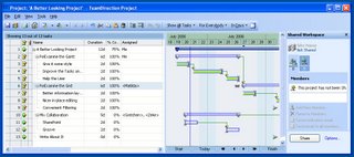
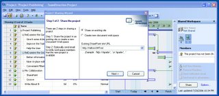
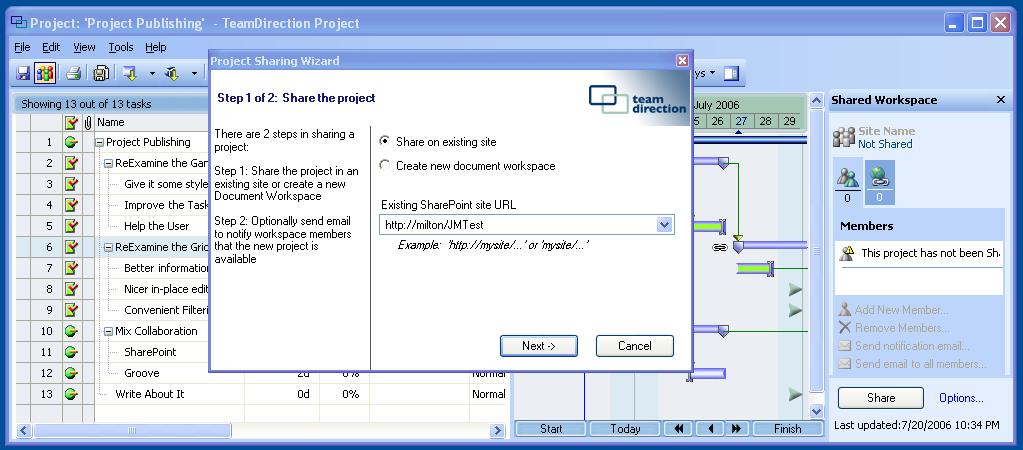
This project has not yet been published, so the shared workspace pane isn't very interesting. But if we publish this project, much like publishing a Word document to a SharePoint site:
We see some neat functionality activate:
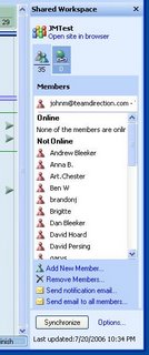
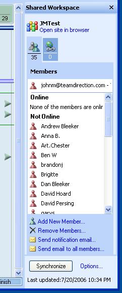
I can see that I'm active in a project with other people, and that I'm no longer 'Me', but in fact a real SharePoint member. I can see everyones Instant Messaging status and chat with them or send them email. And I can see that the 'Share' button is now 'Synchronize'. This particular example uses SharePoint, but by the end of August you will see this working with Groove 2007 as well.
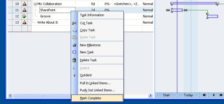
Because I published this project, I've been assigned to the project task. This means I have the ability to edit any task. I notice task 11 (SharePoint) is behind. Well, an article like this makes me think this is complete. So I mark complete:
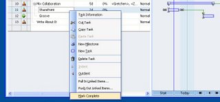
And synchronize the changes by hitting the 'Synchronize' button. All done. The task is now marked complete on my view of the project, and on everyone else's view of the project. However, everyone else also sees an update notification on task 11 (SharePoint) and task 10 (Mix Collaboration).
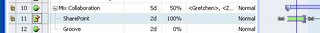
It's our intelligent editor at work. Task 11 contains new information for everyone but me-- the fact that I've finished it. The editor also realized that this affected task 10 as well. Did you see its status changed from behind to on track?
There are a whole host of features supporting Publish, Subscribe and Synchronize, but I wanted to point out that, at its core, its no harder than subscribing to a magazine. A Project Manager publishes a project to a SharePoint (or Groove) workspace. All the members of this workspace receive an invitation they can use to subscribe to the project. But unlike a magazine, each project member has an editor working for them. All project members can make their individual updates, and because of our diligent editor, see the changes of every other project member.
The next post I'll talk about the invitation process a bit more, how you can control membership and assign permissions. But today was about meeting the TeamDirection Project editor. When you have an IntelliGantt™ editor working for you, life, or at least project management, really can be that simple.
The best you could hope for was putting your printer on the network and sharing it. And most of the time it was just hope, because who could divine twisted pair or coaxial, lpt1 or lpt2, queueing or spooling. Usually not the person in front of the computer-- unless that person was in fact Carlos Castaneda.
If you happened to be so lucky as to acheive a fully operational network printer, then you probably reasoned that the man-years it took to achieve this feat would be returned tenfold by the ability to share documents. Your business would reap the rewards of this competitve advantage. Businesses that didn't have network printing would fall in the dustbin of history, and you would rule the.... what's that? That wasn't the right version of the document? Well, maybe print it out again and announce that this is the right version. And then staple it to a visible spot like outside your office, then make ten copies for everyone everyday until you break the printer.
So everyone needed a better solution. Software Architects around the world channeled Carlos and came up with ethernets that could connect desktop computers to each other, and to servers where you could share documents. If you happened to be so lucky as to acheive a fully operational network server, then you probably reasoned that the man-years it took to achieve this feat would be returned tenfold by.... what's that? That wasn't the right version of the document? Julie wrote over your changes? And Bob's? And yours? Well, how about giving one person ownership of the document and trying out this new email thing. If everyone starts using email, the company will enjoy a competive advantage and rule the...
Which is all a very longwinded preface to how you really want to share documents. Honest. And if your business goes on to rule the... well, remember you heard it here first.
How have we solved the problem of sharing documents? Or, actually in our case, sharing projects? By keeping it simple. That is to say, we took a look at well-established, successful patterns of sharing and decided there's no better way than Publishing, Subscribing and Writing Letters to the Editor-- which we'll call Synchronization.
Magazines publish articles and readers who enjoy the articles subscribe to it. As a result, an efficient, mostly one-way, distribution channel is set up. But those letters to the editor are really interesting. While they can apply to the whole magazine, they might also correct a particular article. If the magazine's editor agrees, then he or she may even update the article with the correct information. In a sense, that article has just been Synchronized. That is, the content of the article and the content of the letter have been intelligently merged by the magazine's editor.
And this works great, as long as you have an editor. But a good editor can be hard to find. What would happen if intelligent software could do the merging? Well, you'd have a solution like TeamDirection Project. It's like an editor working for you managing the publication and subscribtion of projects, and all those letters to the editor-- which we call task updates, resource assignments, project rescheduling and such.
Allow me to introduce you to our editor and to our version of Publish, Subscribe and Synchronize.
If you go back a couple posts, you remember the IntelliGantt™ and Task Grid. Here we lift the covers off a third pane: The Shared Workspace. (It should look very familiar to SharePoint users).

This project has not yet been published, so the shared workspace pane isn't very interesting. But if we publish this project, much like publishing a Word document to a SharePoint site:
We see some neat functionality activate:
I can see that I'm active in a project with other people, and that I'm no longer 'Me', but in fact a real SharePoint member. I can see everyones Instant Messaging status and chat with them or send them email. And I can see that the 'Share' button is now 'Synchronize'. This particular example uses SharePoint, but by the end of August you will see this working with Groove 2007 as well.
Because I published this project, I've been assigned to the project task. This means I have the ability to edit any task. I notice task 11 (SharePoint) is behind. Well, an article like this makes me think this is complete. So I mark complete:
And synchronize the changes by hitting the 'Synchronize' button. All done. The task is now marked complete on my view of the project, and on everyone else's view of the project. However, everyone else also sees an update notification on task 11 (SharePoint) and task 10 (Mix Collaboration).

It's our intelligent editor at work. Task 11 contains new information for everyone but me-- the fact that I've finished it. The editor also realized that this affected task 10 as well. Did you see its status changed from behind to on track?
There are a whole host of features supporting Publish, Subscribe and Synchronize, but I wanted to point out that, at its core, its no harder than subscribing to a magazine. A Project Manager publishes a project to a SharePoint (or Groove) workspace. All the members of this workspace receive an invitation they can use to subscribe to the project. But unlike a magazine, each project member has an editor working for them. All project members can make their individual updates, and because of our diligent editor, see the changes of every other project member.
The next post I'll talk about the invitation process a bit more, how you can control membership and assign permissions. But today was about meeting the TeamDirection Project editor. When you have an IntelliGantt™ editor working for you, life, or at least project management, really can be that simple.
Tuesday, July 18, 2006
The Long Tail of Advertising
Have you ever written an advertisement? This blog is an ad of sorts, but I'm talking about a real honest-to-goodness ad. Something that tries to capture your imagination. In 100 words or less. In HTML. With little or no graphics. Sound daunting? It is. However, it's also only $30, so I can try, try again. Wecome to a revolution!
In the past someone like me would have to shell out a very uncomfortable sum of money to publish an ad in one of the 'recognized' industry periodicals. And I don't even dream about broadcasting like television. Instead, I dream of niche sites that have a greater proportion of interested parties and of ads that cost less to both purchase and produce. And I dream its so cheap I can set up metrics, produce a series and track the results over a one or two month campaign. It's how the big boys with multi-million dollar budgets do it, only I'm a small boy with a very small budget.
Luckily, sometimes dreams do come true. Perhaps you've heard the Long Tail of Merchandising, as espoused by Chris Anderson of Wired Magazine? Well, the converse is also true, and its called the Long Tail of Advertising. And it turns out Chris has a book on on the whole mishegoss. It's a definite must read, with the particular twist that I'll get to read about what I'm doing.
The beautiful thing is it brings cost of scale so that advertising and marketing campaigns are available for the rest of us. And you can argue its even more cost effective since the segments have a higher proportion of interested parties.
Which brings us to the new problem. I can't write ads. This blog is sort of an ad, but not really. Here I can talk at length-- which I have no problem doing. But an ad requires you to be brief, understandable and captivating. While I was an English major for a while, I did in fact end up with a Computer Science degree, and producing brief, understandable and captivating prose scares me.
Not advertising is not an option. So I have to start somewhere. Contrary to popular belief, merely placing a shingle on the web does not lead to your product being sold, tried or even known. It may be awkward at first, just like a homemade video uploaded to youtube, but it'll get better.
Why? Because as a computer scientist I will try, try again. That is, run many ads over several weeks with slight variations to content, and measuring the results of each run. I still have to figure out how to account for randomness-- things like vacations, placement, lead stories, moods, etc-- but I am a computer scientist and if there's one thing I can do is repeat myself again and again.
Which reminds me of a joke I heard a long time ago.
A physicist, a statistician and a computer scientist were staying at a hotel. Due to some rather unfortunate wiring, each experienced a small fire in their rooms while they were sleeping. The physicist sprang out of bed and bounded to his notepad where he performed a series of intense calculations over hydrodynamics and splash patterns. When he arrived at the answer, he filled a glass with the exact amount of water and threw it in the precise spot to douse the flames.
The statistician, upon waking up with flames in the room, leapt to his suitcase and found the specially designed faucet hose attachment he had custom made because he knew the odds of experiencing a fire in a hotel room were to great to ignore. Turning the water on full blast, he proceeded to fill his room with an inch of water in order to reduce the chance of further flames to nil.
When the computer scientist woke up with flames in the room, he opened his notebook computer, which was right beside him in bed. He wrote a quick graphical UI that asked the user to input the amount of fire, in joules, and the requested amount of water, in ounces. He then ran it a couple of times until he was satisfied, finished with a nifty animation of water flying across a room and smothering the fire, and went back to sleep.
Wednesday, July 12, 2006
The Play's the Thing
My wife and I saw Richard III last night at the Intiman Theater in Seattle. Usually when I watch a Shakespeare play, I try to read it beforehand in order to acclimate myself to Ye Olde English. Well, didn't get around to it this time and I was a bit nervous. Sure I know the basic plot, but the story is not the thing in Shakespeare, its the transcendent meaning. After all, Richard III was written more than 400 years ago and there we were finding a parking spot for the car, purchasing the tickets with a credit card and turning off our cell phones. Yet here there we were in 2006 watching a play written in 1592 about events in the late 1400s. How does that work?
It's all in the presentation.
Well, not all in the presentation, for Shakespeare's genius does in fact capture inimitable truths about human nature as few ever have. But given the raw text and minimal direction of his long-ago creation, the production company and the actors have to make it accessible to the modern day audience. Accessibility is distinct from relevance. Shakespeare's timelessness, and perpetual timeliness, is the result of of his relevance. Sure we may have cars, credit cards and cell phones, but basic human frailties haven't changed much over the years.
It's how we present and communicate the play's relevance that makes the production successful or not. Things change over the years-- wherefore becomes why, thou becomes you and thee becomes y'all. Their dress looks a little funny (can't wait to see what our low-slung pants around the ankles style looks like 400 years from now), and not many people speak in a rigorous meter anymore. But even with all this, a well-delivered 'Thou poisonous bunch-back'd toad' is still a dandy insult.
There are also many things much older than Shakespeare's illustrious plays that maintain their relevance even as their presentation changes. Money, for example. How many shells with holes in the middle do you have in your pockets right now? OK, how about nickels then? You can even see changes more recent than that. When is the last time you wired money to anyone? Western Union used to have an awesome business, but they missed the boat when checks and credit cards made their appearances. Speaking of checks, do you think we will still have them in another 50 years? Maybe just for fuddyduddies like me.
Which brings me, of course, to Project Management. How long do you think that's been around? Probably around the time people started dividing up work in order to gather food is when Homo Projectus proclaimed his first milestone. Over the millennia the projects may have gotten more complex and esoteric, the tools more sophisticated and overwelming and the deliverables more abstract and ineffable, but who here among us didn't feel a certain primordial, ancestral satisfaction when they wrote their milestone date down in stone?
Can you make Project Management more accessible? Far from tilting at windmills, we think you can. And the power of bringing it to everyone will enable teams to do more than ever before. We are but the production company doing our best to provide intelligible tools and a few interpretations of what it means for a team to collaborate on a project.
Indeed the play, or the software, is the thing.
Crossing the Gulch
Anyone worth their marketing salt will attest they have read Geoffry Moore's "Crossing the Chasm". And if they're worth their salt and they haven't read it, then they won't admit it. For the folks that haven't read it, it's about how you market new technologies.
We have been focusing on two technologies recently: SharePoint and Groove. We've brought our project management expertise to both, but what's really been interesting is how successful SharePoint has been crossing the chasm while Groove has had a bit harder go of it. Why is it interesting? Because not a lot separates the functionality of SharePoint from the functionality of Groove.
Huh?
I'm currently involved with building the next version of our tool, and it will have some really exciting new features. Perhaps the feature I'm most excited about is our integration with Groove 2007. After Microsoft purchased Groove in 2005, we realized that SharePoint and Groove were not two radically divergent means of collaboration, but really two similar solutions for harnessing collaboration and distribution. Imagine a river. Information is flowing; how do you want to distribute it? Or interact with it? On one back bank you have people that like a broad reach and an easy deployment. On the other bank you have people that like a targetted distribution and a rich environment. It turns out we can all get along.
It struck me as I laid out the abstraction layer for the two systems was how easy the work was. Maybe the sleep deprivation caused by two young kids sparked a brief moment of genius while I specified the architecture we would need. Or maybe TeamDirection got really lucky that they sleep deprived guy they assigned the abstraction layer to wouldn't have to think too hard since the feature sets were so similar.
Both SharePoint and Groove use a workspace metaphor to encapsulate work. Both systems use tools (web parts in SharePoint and Tools in Groove) to provide functionality for specific kinds of work: a file library, a discussion list, membership(!). There are two differences between the two:
1) SharePoint is centralized and therefore ideal for massive information distribution
2) Groove is decentralized and therefore ideal for targetted information distribution
And that's about it. Sure the actual APIs between the two are different. And you can do things with decentralized code you can't do with centralized code (like work offline!). And you can do things with centralized code you can't do with decentralized code (like check out a document). But these are artifacts of the implementations-- the actual architecture is more similar than not. It's not a chasm that separates SharePoint and Groove, but a gulch.
So why did SharePoint achieve such popularity while Groove lagged behind? Nothing more than the natural evolution of software. What's old is new again (did you know that old mainframes make great web servers?). Groove simply wasn't old enough to be new again. I think it was a brilliant move by Microsoft to purchase Groove for it really is the mirror of SharePoint's rising star. But SharePoint doesn't solve all the worlds collaboration problems any more than Groove does. Groove doesn't need to cross the chasm (or gulch), but just improve steadily until the user community comes to it.
Where does that leave TeamDirection? Hopefully in the gulch right between the two, which is a great place to build a bridge. TeamDirection Project for SharePoint will soon become TeamDirection Project for SharePoint and Groove-- at which point our marketing department will kick into high gear for a slightly shorter name (I'll be pushing for IntelliGantt). I can imagine a small focused group using Groove to plan a project, and a larger group using SharePoint to execute it. Or a large project in SharePoint broken into multiple smaller projects to be executed by focused Groove teams.
We believe collaboration is a very broad category best served by at least two different strategies (centralized AND distributed) and Office 2007 will have two of the best. We plan to be the well-thought-out, friendly interface managing the complex distribution of information between them, so you can just focus on your projects and get the job done.
Monday, July 10, 2006
A Better Task Grid
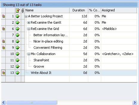
What's it like trying to reinvent the wheel? Hard. How would you like to be assigned the task of reinventing the wheel? No? Well, when the job came for our crack team to develop the Task Grid, two men stepped up and relished the challenge. We need to protect their identities, but between them are more than twenty years of UI development experience. And here is what they came up with:
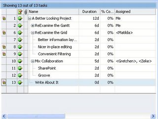
Like the IntelliGantt, the Task Grid has a nice palette and style. And like the IntelliGantt, it adds new features to improve information flow-- especially for indviduals working in groups. For instance, did you notice the first four columns? It's a heads up display that gives you what has changed, task id, current status and whether this task has an attachment.
What do I mean by what has changed? Remember, while you can run TeamDirection Project as a standalone application, it really shines as a connected smart client. These update markers tell you someone has updated this task. That's right, rather than opening a project file on a network server and having to deduce what the differences are, we do the deducing for you. As time goes on, I expect this will get richer and richer-- like who changed what, and when, and why. And by the way, we do look at SharePoint permissions; you can only change task information if you're an Administrator or a Contributor assigned to the task. But that's another blog entry.
Task IDs are necessary, but not often considered amazing, so I'll move on to the current status. As you can see with this project, everyone has been very diligent and the project is humming along smoothly, so we see those green balls. Of course, that's not a very common project, so let's throw a wrench in the works and see what things look like:
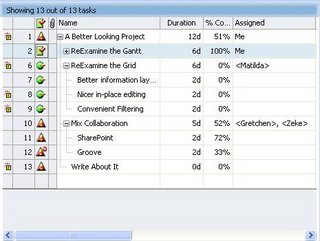
There we go. Here we can see the various statuses (No, not statii. And yes I looked it up). The green ball still means on track, but that red triangle with the exclamation point means things are behind. And because the project has it, the whole project is behind. This is helpful when viewing multiple projects as you can see at a glance which projects you should be worried about, but that's another blog too.
A green column with a red check on it is always nice to see as this tells the world this task is complete. Or, if its a summary task, all the sub tasks are complete. What you don't want to see is the status image of task 12. This is a red triangle with a little 'Do Not Enter' circle (like the US road sign) in the upper right. This means not only is the task behind, but its blocking other tasks too. (Note, in yet another blog entry I'll show you how to filter tasks so you can easily see all the blocking tasks-- I have a lot to write about!)
The fourth column represents attachments. Attachments are really hyperlinks associated with particular tasks. For example, say you have a task called 'Perform Audit Review'. You can attach a hyperlink to this task that takes you to a page explaining how to do an audit review. Or maybe the task is 'Deliver Images', and the hyperlink takes you to a page full of images. Basically, if it's linkable, it attachable.
I've spent this most of this post talking about the first four columns, which is really shortchanging the other twenty. Twenty sounds like a lot to work with, but remember, our master grid team brings over twenty years of UI experience to this project. When you work with the grid, you will realize how intuitive it is, how defaults are always provided and how few mouse clicks it takes to fill out information.
Have you ever clicked in a cell meaning to edit some text, typed a letter and watched all the text disappear? This has happened to our crack grid team enough times that they decided to do something about it. You will notice when you click on the task name in our product, yes, you are put into edit mode, but no, we don't select all the text and open the door for problems. Rather, the edit caret is placed where you clicked the mouse. That's nice.
Or take a look at this duration control:

The duration value and the duration scale are distinguished and individually editable. Maybe you've memorized all the letter combinations for scaling with respect to the English language, but a design like this is subtle in its elegance on two levels. 1) You don't need to be concerned with the correct scaling acronym-- it shows it for you and 2) This is much easier to localize than figuring out all the various letter requirements for various languages. This design has made duration changes as easy as point and click.
Or how about a more complex control like assigning resources? Something like this:
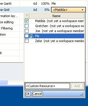
Isn't it nice you can see what resources are already in the system, and how they are spelled? This reduces the number of duplicate resources that often appear in a system purely from misspellings or misunderstandings. But if you'd like to add a new custom resource, you can. Again, an edit control like this one provides a nice amount of information, a nice context to work in and an area we can add more features to in the future. Nice Design!
OK, last thing. Did you notice Me in there? That's You. It's not just a personalization feature, but also a result of this being a collabortive tool. You'll notice their other names say '(not yet a workspace member)'. This is because this project hasn't been published yet. Once it becomes published, Me turns into the SharePoint version of you, including your permissions as well. And Matilda and others can be mapped to SharePoint members in the workspace. This means you can build your project in standalone mode, and then publish it to SharePoint to begin working in collaborative mode.
What does the future hold? As much as our crack team can imagine. But I can imagine more fields with nifty controls, more ways to inform the user of changes to the project and even improvements to the current controls. I can also imagine your feedback and ideas will help keep the team employed for a long, long time. And we like that!
Sunday, July 09, 2006
A Little Too Polite?
When I go to the East Coast, I can't help but observe the diiferences with the West Coast. And, because I'm invariably renting a car and giving a bad reputation to every person not from Boston, it always strikes me how many honks I receive in a town on the East Coast versus here in Seattle. Now, it could be I'm simply a better driver in Seattle, or progressively worse with each timezone I cross. Could be.
It could also be people are more ready with the horn in a town like Boston (not to pick on Boston, its a lovely town, but I think I've received more honking per hour of driving there than anywhere else). At first I was taken aback since it was so outside my norm. However, whenever I return from the East Coast (re: Boston), I find myself just a little quicker on the horn myself.
At first I thought I was being less polite, and a case could be made I'm being less polite to the person I'm honking at. However, most of the honking on the East Coast occurs when I'm pausing in a rotary trying to figure out if I need to turn right here, or continue on another 237 feet (at 50 mph mind you). Similarly, I've only just started using the horn when I'm stuck in a lineup and I see a cell phone in one hand and a grande latte in the other. In this case, I think its appropriate to honk and let the person know they should put their cell phone down, make their right turn and finish their grande (Full Disclosure: My wife, kids and I are Starbucks shareholders, so please, next time make it a venti-- it's for the kids).
However, when I really feel empowered to honk is when there's a lineup behind me. The more cars behind me, the more I feel its my civic duty help move things along in the name of commuters everywhere.
What does this have to do with Project Management Software? I'm here to tell you software companies like it when you honk at them, not just Project Management companies, but all companies-- especially the smaller, highly impressionable ones like mine. You could say honking is how software improves in this world, no matter what coast you live on (or in between too).
I'm not saying you should identify every techno geek and honk at them, or furtively drive through Microsoft's campus and lay on the 'Aaaooooooga'-- this will not help software quality.
But emailing the company with your thoughts, participating in their forums or, possibly the most powerful form of digital honking, posting your experience to a blog is a very, very good way to get things moving. No company wants something akin too AOL cancellation posted on the web-- at least not a company that wants to grow.
Contrary to popular opinion, no news is not good news. No news is the absence of news, which is the absence of information. Which means if you need to make decisions for your product, you are making them with no other information than you're own gut. And while truthiness may work for some things, turns out it's not so good for making customers happy.
And I'm not talking about polite 'gosh, you're product is swell'. What I want is a good HONK along the lines of 'you're product is awful... and I'll tell you why.' This last part is the most important, because honkers tell it like it is.
The result will be a product that is better and makes more people happy. This is what I want, you want, and all of humanity wants. Kind of like when you honked last Wednesday to get that SUV moving and free 10 cars behind you. Not only did you help your cause, but you performed a civic duty helping those in the same situation.
So please, give us a HONK.
Saturday, July 08, 2006
Today's Collaboration Forecast
Living in Seattle, you become quite accustomed to a constant drizzle. It's always kind of grey-- not necessarily dreary like a London sort of grey, just luminescent grey. It's also always a bit wet-- not necessarily soaking like a tropical downpour wet, just cool crisper wet (Seattlite's with grey and rain are kind of like Eskimo's with ice and snow). You get so used to it you don't see it anymore. For instance, there are plenty of times when I'll go for a walk in a T-Shirt and by the end of the walk it dawns on me 'Hey, I'm not soaking, but I'm cool crisper wet! Is it drizzling? Yep, and luminescent grey.'
It's usually not until a relative from a warm, sunny climate comes to town and views things through those Southern Californian eyes (it doesn't have to be from CA, it could be from anywhere-- and I'm not referring to my brother Thomas who lives in Southern California and just visited). That relative is only too happy to point out the actual state of affairs here in the Northwest, weather-wise, and quickly suggests alternatives, such as moving to Southern California.
When this happens, I quickly remember what my last visit to Southern California was like and recollect the earthquake I survived, the eight lanes of cars I battled and the omnipresence of Michael Jackson on every TV channel. At this, the semi-named relative mirrors my shocked face of moments ago and responds in earnest 'We have earthquakes?'
My point is not to compare and contrast The Great Pacific Northwest and s. calif, but to point out it is very easy, and indeed expected human behaviour, to miss the obvious. In software, when things become so obvious they are categorized as 'ignore' is the marker of the penultimate moment before the change. That is to say, the moment before the moment. Or let's just stick with the calm before the storm.
Are the winds of collaboration ready to blow? Well let's see. Are there any seismic shifts going on that people are taking for granted? How about Web 2.0. Are there any forgotton technologies in use that are really quite useful? Maybe things like SharePoint, WebDAV, Web Services-- all things announced several years ago and quite boring, right?
Any changes in the business landscape that seem important but are in their early stages? How about Google pushing more online applications with greater interactivity and Microsoft responding by paying the world's largest signing bonus to Ray Ozzie and the folks from Groove? AND Ray being empowered to follow his vision with Windows Live.
And where does TeamDirection come in? We hooked a ride with Groove and rode it from the shore to the break. Now we are among the surfers bobbing in the swell looking for their next ride. And we're not alone. But we're making our bets on enabling collaborative tools like SharePoint, Groove, Web Services, WebDAV, Instant Messaging and Smart Clients to catch the perfect wave. I can see it building now...
Surfing? Waves? Maybe its time to visit my brother in Southern California.
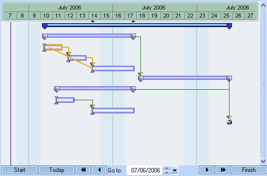
It's Intelligent. It's a Gantt. It's IntelliGantt!
The Gantt Chart has become the standard bearer of project and task information. It has also become a magnet for scorn and ill-will, becoming the embodiment of all that is wrong with Project Management software. People recognize Project Management software not by the familiar grid listing tasks, though that might not be winning many friends either, but by the distinctive two dimension task/time chart.
I'm here to tell you the Gantt Chart is getting a bad rap. We saw a few things we could improve and came up with this:
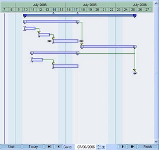
A few things this shot shows us is an improved palette and color scheme; nice distinctions for projects, summary tasks and tasks; current selection indicators on both the date line (subtlely highlighted dates and two small arrows) and draggable link chains on either end of the selected task; a clear directional arrow and the endpoint of each link; and a milestone that looks like a present waiting to be opened.
Definitely improved, possibly pretty, but there's more. There are VCR buttons at the bottom for easier scrolling, and a date box that takes you when you want to go. Just outside of the VCR buttons are Start, Today and Finish. These buttons take you to the Start of the project, Today's date and the Finish of the project. You could say we paid a little more attention to time travel in this product!
Now for a few 'hidden' features, in the sense that they're not immediately apparent, but they are immensely helpful. In keeping with the time theme, the first one helps you oriented on tasks with respect to the current viewing date. Here's a picture:
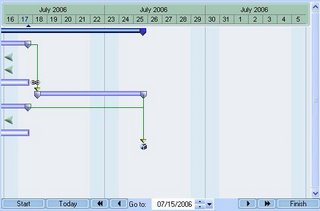
What happened? The view window moved into the future 9 days, from July 7 to July 16. What was the result of that move? Well, the tasks all moved to the left, appropriately, but some tasks moved so far that they're no longer visible for this view. We could simply forget about them, but we thought it would be helpful to give you an arrow showing where that task is on the timeline-- either in the past like these three, or in the furture. And yes, you can click on that arrow and it will snap into view.
Another feature designed to help you out deals with scheduling and task linking rules. I don't know about you, but I can't keep a very good mental image of task link dependencies in my head. If I can't make one task dependent on another, I'd like to know why instead of figuring it out myself. Something like this would be extremely helpful:
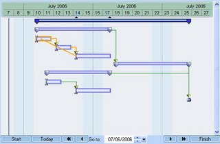
This shows me what the problem is before I get my hopes up that I can make this link. Our philosophy regarding project management in general is its better to warn people beforehand than tell people afterward. This is an example of our philosophy in action. By the way, you didn't have to press a button to get the conflicting path to light up. This gantt chart is interactive-- as you drag the link endpoint over any task, it will either pass or fail a link test. If it fails, it turns orange (as you see); and if it passes, it stays green.
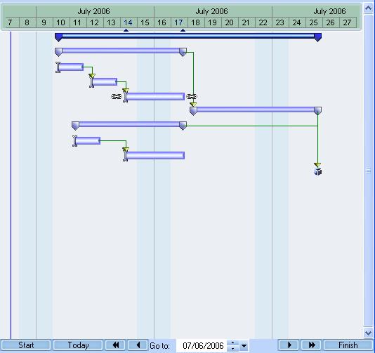
Though there is more, I'd like to wrap up with a wish I've always had: Don't you just want to drag a summary task sometimes? You know, put this block of tasks starting here. Me too. In fact, sometimes I'd like to drag the whole project backwards or forwards if for no other reason than to show our customers how flexible we can be with scheduling.
And that's what I do with TeamDirection Project. I can drag summary tasks and projects forward and backwards. It makes for very nice scheduling flexibility and works very well for templates (copy, paste, move).
And when you try it out, wait til you see what happens to dependent successor tasks. It's interactive and way cool!
You can download it HERE.
I'm here to tell you the Gantt Chart is getting a bad rap. We saw a few things we could improve and came up with this:
A few things this shot shows us is an improved palette and color scheme; nice distinctions for projects, summary tasks and tasks; current selection indicators on both the date line (subtlely highlighted dates and two small arrows) and draggable link chains on either end of the selected task; a clear directional arrow and the endpoint of each link; and a milestone that looks like a present waiting to be opened.
Definitely improved, possibly pretty, but there's more. There are VCR buttons at the bottom for easier scrolling, and a date box that takes you when you want to go. Just outside of the VCR buttons are Start, Today and Finish. These buttons take you to the Start of the project, Today's date and the Finish of the project. You could say we paid a little more attention to time travel in this product!
Now for a few 'hidden' features, in the sense that they're not immediately apparent, but they are immensely helpful. In keeping with the time theme, the first one helps you oriented on tasks with respect to the current viewing date. Here's a picture:

What happened? The view window moved into the future 9 days, from July 7 to July 16. What was the result of that move? Well, the tasks all moved to the left, appropriately, but some tasks moved so far that they're no longer visible for this view. We could simply forget about them, but we thought it would be helpful to give you an arrow showing where that task is on the timeline-- either in the past like these three, or in the furture. And yes, you can click on that arrow and it will snap into view.
Another feature designed to help you out deals with scheduling and task linking rules. I don't know about you, but I can't keep a very good mental image of task link dependencies in my head. If I can't make one task dependent on another, I'd like to know why instead of figuring it out myself. Something like this would be extremely helpful:
This shows me what the problem is before I get my hopes up that I can make this link. Our philosophy regarding project management in general is its better to warn people beforehand than tell people afterward. This is an example of our philosophy in action. By the way, you didn't have to press a button to get the conflicting path to light up. This gantt chart is interactive-- as you drag the link endpoint over any task, it will either pass or fail a link test. If it fails, it turns orange (as you see); and if it passes, it stays green.
Though there is more, I'd like to wrap up with a wish I've always had: Don't you just want to drag a summary task sometimes? You know, put this block of tasks starting here. Me too. In fact, sometimes I'd like to drag the whole project backwards or forwards if for no other reason than to show our customers how flexible we can be with scheduling.
And that's what I do with TeamDirection Project. I can drag summary tasks and projects forward and backwards. It makes for very nice scheduling flexibility and works very well for templates (copy, paste, move).
And when you try it out, wait til you see what happens to dependent successor tasks. It's interactive and way cool!
You can download it HERE.
Intelligent and Clever Project Management
Project Management doesn't have to be drab... or boring... or pedantic... or intimidating... or a myriad of negatives your imagination can fill. While some kind of management may be necessary, if you want people to buy into it, it has to be... usable... and understandable... and intuitive... and productive... and even pleasurable.
I offer Exhibit A:

While it may not be so pretty as the face that launched a thousand ships, it could certainly build a thousand ships.
Why is look and feel so important? Think about your operating system for a moment. Do you realize how much effort, over the years, has gone into making your operating system:
User Friendly
User Friendly
Ubiquitous
User Friendly
Robust
User Friendly
Secure
And did I mention User Friendly?
The number one key to adoption is making your application, be it on the web or on your hard disk, be it on Windows or on Mac OS, be it 96 dpi or 120 dpi, User Friendly . We believe a computer user wants things well laid out and understandable. And if it happens to entertain them just a little bit along the way, all the better. And that's why there is such a thing as eye candy, which we prefer to call Design.
But in fact it is design, certainly by design, that the operating system has become more friendly over the years even as its grown more powerful. Raise your hand if you still prefer a command line. Have you noticed that 100x the population does not?
This isn't to say Project Management tools are currently at the command line stage, but they are also not at the Windows Vista stage either. Everyone we talk to laments the Project Management experience. All the rules and minutia. The arcane nomeclature. Grids and Gantt charts as appealing as concrete. And of course, who likes deadlines! Face it, intelligible and accomodating Project Management will happen only when... well, when it becomes a priority. And in this day of ever-growing interconnectedness, its a has become a priority.
We've tried to design both the UI experience and the Data experience for the user to provide information, feedback and utilitiy. Which leads us to our upcoming series of posts. Our Design Decisions.
I offer Exhibit A:
While it may not be so pretty as the face that launched a thousand ships, it could certainly build a thousand ships.
Why is look and feel so important? Think about your operating system for a moment. Do you realize how much effort, over the years, has gone into making your operating system:
User Friendly
User Friendly
Ubiquitous
User Friendly
Robust
User Friendly
Secure
And did I mention User Friendly?
The number one key to adoption is making your application, be it on the web or on your hard disk, be it on Windows or on Mac OS, be it 96 dpi or 120 dpi, User Friendly . We believe a computer user wants things well laid out and understandable. And if it happens to entertain them just a little bit along the way, all the better. And that's why there is such a thing as eye candy, which we prefer to call Design.
But in fact it is design, certainly by design, that the operating system has become more friendly over the years even as its grown more powerful. Raise your hand if you still prefer a command line. Have you noticed that 100x the population does not?
This isn't to say Project Management tools are currently at the command line stage, but they are also not at the Windows Vista stage either. Everyone we talk to laments the Project Management experience. All the rules and minutia. The arcane nomeclature. Grids and Gantt charts as appealing as concrete. And of course, who likes deadlines! Face it, intelligible and accomodating Project Management will happen only when... well, when it becomes a priority. And in this day of ever-growing interconnectedness, its a has become a priority.
We've tried to design both the UI experience and the Data experience for the user to provide information, feedback and utilitiy. Which leads us to our upcoming series of posts. Our Design Decisions.
Subscribe to:
Posts (Atom)


