
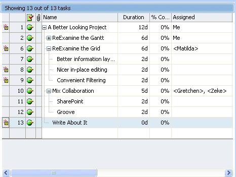
Like the IntelliGantt, the Task Grid has a nice palette and style. And like the IntelliGantt, it adds new features to improve information flow-- especially for indviduals working in groups. For instance, did you notice the first four columns? It's a heads up display that gives you what has changed, task id, current status and whether this task has an attachment.
What do I mean by what has changed? Remember, while you can run TeamDirection Project as a standalone application, it really shines as a connected smart client. These update markers tell you someone has updated this task. That's right, rather than opening a project file on a network server and having to deduce what the differences are, we do the deducing for you. As time goes on, I expect this will get richer and richer-- like who changed what, and when, and why. And by the way, we do look at SharePoint permissions; you can only change task information if you're an Administrator or a Contributor assigned to the task. But that's another blog entry.
Task IDs are necessary, but not often considered amazing, so I'll move on to the current status. As you can see with this project, everyone has been very diligent and the project is humming along smoothly, so we see those green balls. Of course, that's not a very common project, so let's throw a wrench in the works and see what things look like:

There we go. Here we can see the various statuses (No, not statii. And yes I looked it up). The green ball still means on track, but that red triangle with the exclamation point means things are behind. And because the project has it, the whole project is behind. This is helpful when viewing multiple projects as you can see at a glance which projects you should be worried about, but that's another blog too.
A green column with a red check on it is always nice to see as this tells the world this task is complete. Or, if its a summary task, all the sub tasks are complete. What you don't want to see is the status image of task 12. This is a red triangle with a little 'Do Not Enter' circle (like the US road sign) in the upper right. This means not only is the task behind, but its blocking other tasks too. (Note, in yet another blog entry I'll show you how to filter tasks so you can easily see all the blocking tasks-- I have a lot to write about!)
The fourth column represents attachments. Attachments are really hyperlinks associated with particular tasks. For example, say you have a task called 'Perform Audit Review'. You can attach a hyperlink to this task that takes you to a page explaining how to do an audit review. Or maybe the task is 'Deliver Images', and the hyperlink takes you to a page full of images. Basically, if it's linkable, it attachable.
I've spent this most of this post talking about the first four columns, which is really shortchanging the other twenty. Twenty sounds like a lot to work with, but remember, our master grid team brings over twenty years of UI experience to this project. When you work with the grid, you will realize how intuitive it is, how defaults are always provided and how few mouse clicks it takes to fill out information.
Have you ever clicked in a cell meaning to edit some text, typed a letter and watched all the text disappear? This has happened to our crack grid team enough times that they decided to do something about it. You will notice when you click on the task name in our product, yes, you are put into edit mode, but no, we don't select all the text and open the door for problems. Rather, the edit caret is placed where you clicked the mouse. That's nice.
Or take a look at this duration control:

The duration value and the duration scale are distinguished and individually editable. Maybe you've memorized all the letter combinations for scaling with respect to the English language, but a design like this is subtle in its elegance on two levels. 1) You don't need to be concerned with the correct scaling acronym-- it shows it for you and 2) This is much easier to localize than figuring out all the various letter requirements for various languages. This design has made duration changes as easy as point and click.
Or how about a more complex control like assigning resources? Something like this:

Isn't it nice you can see what resources are already in the system, and how they are spelled? This reduces the number of duplicate resources that often appear in a system purely from misspellings or misunderstandings. But if you'd like to add a new custom resource, you can. Again, an edit control like this one provides a nice amount of information, a nice context to work in and an area we can add more features to in the future. Nice Design!
OK, last thing. Did you notice Me in there? That's You. It's not just a personalization feature, but also a result of this being a collabortive tool. You'll notice their other names say '(not yet a workspace member)'. This is because this project hasn't been published yet. Once it becomes published, Me turns into the SharePoint version of you, including your permissions as well. And Matilda and others can be mapped to SharePoint members in the workspace. This means you can build your project in standalone mode, and then publish it to SharePoint to begin working in collaborative mode.
What does the future hold? As much as our crack team can imagine. But I can imagine more fields with nifty controls, more ways to inform the user of changes to the project and even improvements to the current controls. I can also imagine your feedback and ideas will help keep the team employed for a long, long time. And we like that!


No comments:
Post a Comment