Tuesday, April 30, 2013

Improved Projects, Tasks and Swimlanes

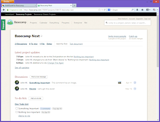
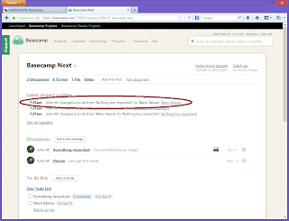
In our last post we introduced how you can use swimlanes to see a series of tasks horizontally for specific users. This makes it easy to see what tasks may be unassigned and who has a gap in their production. Then, and I quote,

To make the assignment, expand the 'Basecamp Next' folder once more so that we can get to the assignment editor.
.

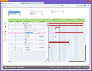
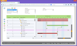
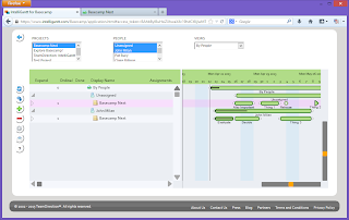
That would be a fail. Nobody wants to go here, there and round everywhere to do an important and common operation. So we improved the user experience by letting you simply click on the assignments within the swimlane. You can try it yourself, but first here's how it looks:

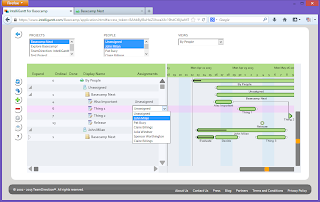
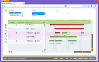
This shows the swimlanes for two users with respect to project 'Basecamp Next'. We have selected two users in the PEOPLE list box so that only their tasks are shown. Note that 'Thing 1' is unassigned. We can simply click on the 'Unassigned' text right below the 'Thing 1' task.

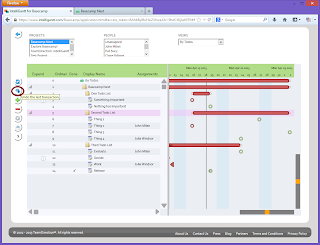
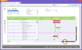
Whether by mouse or by touch, things brings up a select box of users to choose from for reassignment.

We will select the user just below 'Unassigned'...

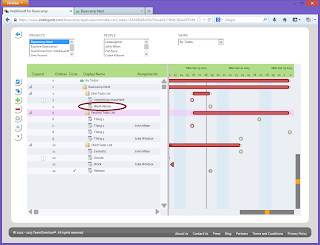
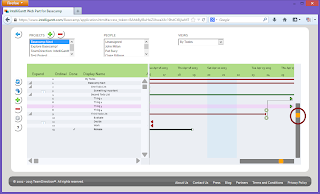
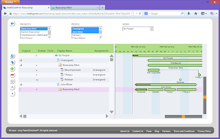
... and see 'Thing 1' shift down into the other users swimlane, nestled nicely between 'Decide' and 'Thing 3'.

We think this is a better user experience for both comparing and reassigning tasks as easily as possible. It's also an example of how we don't rest until things are right.

Monday, April 22, 2013

Projects, Tasks, People and Swimlanes

Tasks and People. People and Tasks. If you have a project, you cannot have one without the other. But what is the best way to see them all? Is it better to show a project organized by tasks with a separate column for assignments? Or is it better to organize by people and show all their tasks? In this case we feel there's not a one-size-fits-all answer so IntelliGantt provides both. It has an option to view 'By Tasks' or 'By People', simply select the view you wish and we will quickly rearrange everything for you. Need to toggle between both views? You can either flip back and forth by the VIEWS selection choice. Or you can have two web browsers up, one viewing by tasks and the other by people. We're just here to help you see everything. Let's see how they look.

In traditional project management software you often start with a task centric view. That is, you have a top-level task that contains sub tasks which can contain more sub tasks, and so on. Each task can then be assigned to a person. This view let's you see all the tasks laid out in a hierarchy and see who's responsible for them. Here is IntelliGantt with the traditional view:
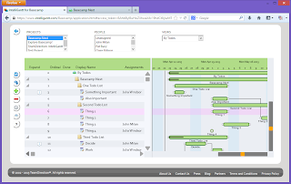
Because you can assign multiple tasks to a person, there will be more tasks than people in this view. If you would like to maintain a view of all the tasks being worked on but for specific people, you can simply select their names in the PEOPLE list. This list does support multiple selection with the web standard of holding down the control key when selecting an item. If you are using a mobile device, then those devices will have controls that handle multiple selection natively.

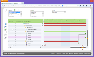
Here is what IntelliGantt looks like with first one person selected and then a second, both using the By Tasks view (in this case we are working with Basecamp so we call them Todos in these screenshots).

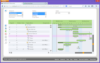
On the other hand, maybe you would rather focus by person and see what they are working on. For example, you might need to see what tasks are still unassigned and who has availability for a span of time. For this case IntelliGantt has the 'By People' view. Simply drop down the selection and choose it. IntelliGantt does the hard part of reorganizing everything for you.
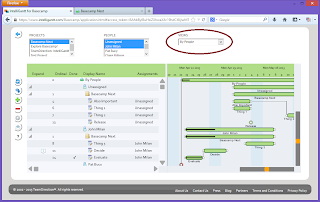
We organize this view by placing the person at the top, projects underneath with their assigned tasks at the third level. The idea is to group by resources, then projects and a flattened task hierarchy in order to make workload comparison both by person and project easier.
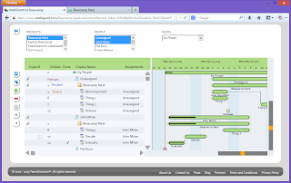
If you have many users and you only want to see a couple to compare (as in this example), you can use the same 'PEOPLE' filter as before by simply clicking (or touching on mobile!).

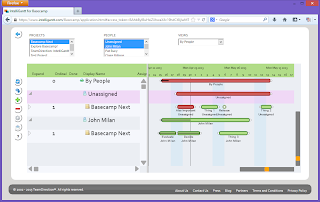
So once we have selected the projects and people to look at, IntelliGantt introduces a third way to help you do quick comparisons-- swim lanes! When you collapse a row IntelliGantt will 'remember' the children and display them in the gantt chart. This makes great use of all the space in the gantt chart and makes it easier to eyeball two horizontal lines of tasks. In our example, the top swim lane is all unassigned tasks and the bottom swim lane is all tasks for some scrub named John Milan.
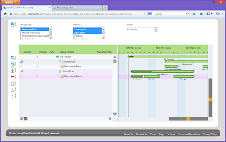
The first thing we notice is the jumble of unassigned tasks around the first of the month. Unassigned jumbles are rarely good. So we drag and drop the tasks along the timeline by mouse or by finger in order to see the discrete parts.
Now that we've cleared the jumble, we see that Mr. Milan has an opening that perfectly matches the 'Thing 2' task. We can assign Thing 2 to John and move on to the next scheduling issue. To make the assignment, expand the 'Basecamp Next' folder once more so that we can get to the assignment editor. Click in the assignment cell and select 'John'.
Thing 2 will now appear in John's swimlane, squeezing in perfectly.
With these IntelliGantt tools you can quickly toggle views between 'By Tasks' and 'By People'. Each has their role in a good project management system, representing fundamental ways to view your schedule. Additionally, IntelliGantt provides easy filtering by Project and by Person by simply selecting which you would like to see. Finally, IntelliGantt swimlanes make it easy to do a side-by-side comparison of two or more person's workload. Even if that person is really 'Mr. Unassigned'.

You can try out IntelliGantt for Basecamp today. Or, if you're really curious, you can see how it works within Facebook.
Thursday, April 18, 2013

IntelliGantt for Basecamp - First Steps

We've just gotten the keys to the new car; time to take it out for a spin. IntelliGantt for Basecamp represents not only our latest and greatest visualizations for one of the worlds best PM tools, but also our embrace of the latest version of the web and its technologies. We've mentioned how IntelliGantt can now run in any browser, on any OS and on any device. At the end of the day, however, it still has to work! So let's see it in action.

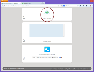
Here are eleven screenshots taking you through a major reason for IntelliGantt's existence-- visualizing and working with Basecamp items. You can follow along if you like by starting at our entry page as well.

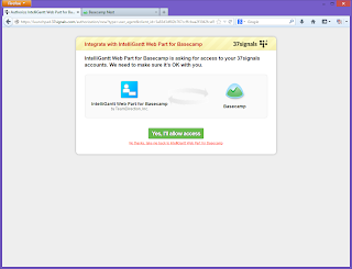
It's as simple as 1-2-3 really. The first thing to do is authenticate with your Basecamp account. Click on the Basecamp logo. You will be taken to the 37 Signals application authorization page.

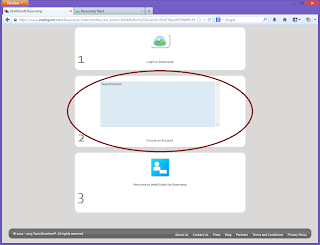
When you agree to let IntelliGantt work with Basecamp, you will return to our entry page. But this time you will see one or more accounts in the listbox within the second white-background area. Select the Basecamp account you would like to work with. (Note: you'll also see popup 'Nag' boxes. Simply click 'OK' to continue along. The boxes will only pop up when a page is fully refreshed).

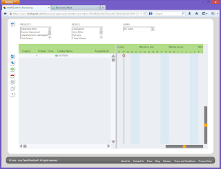
Once selected, IntelliGantt will take you to the next page. This is the main application window that shows all the projects and people in your selected Basecamp account.

Simply select a project in the 'PROJECTS' listbox to view it (and yes, you can select multiple projects and they will all appear in your view. But that's another blog post).

Great, we can see all Todo Lists and Todos in our grid and gantt chart, but where does the interactive part come in? Well, basically you can click or touch on any cell in the grid and edit the value. For example, touch the display name of a Todo and edit it. You will see an in-place text editor pop into the cell.

Type in the new, improved display name and hit the 'enter' key (the real one on a keyboard or the virtual one from a tablet screen) and the change not only happens within IntelliGantt but within the Basecamp project as well.

You'd expect the ability to make changes, but what about undoing your changes? That is available too. In fact, we keep track of your changes so that multiple edits can be undone. 'Multi-level undo' is how desktop applications often describe this feature. We think it works well for the web too.

Finally, as you would expect, these 'undone' changes are also undone in Basecamp as well so things will always stay in sync for you.

As we mentioned above, IntelliGantt for Basecamp is now available for trial. You can do exactly the steps you've seen here with this link. Let us know what you think!

Tuesday, April 16, 2013

IntelliGantt in Facebook

Is it too late to proclaim the World Wide Web as a Brave New World? Probably. But that doesn't mean you still can't enjoy all the new things you can accomplish with the latest HTML and web services. Because we crafted our new IntelliGantt application to be pure HTML5+Javascript, not only can it run on multiple devices, but also within multiple containers as well. What's a container? Anything that wraps a web page and provides an environment. For example, Facebook.
We are just putting the finishing touches on a Facebook integration that not only uses their identification services, but can reside within Facebook itself as a page. To date Facebook is probably better known for offering games this way, but we think a project management solution can greatly benefit from a social platform as well.

Here is the requisite screenshot:

We will have more real soon, but if your curious, you can visit the IntelliGantt app page on Facebook and see it in action.

Monday, April 15, 2013

A Few New Gantt Operations

What is the most important thing to make flexible in a Gantt Chart? We think it has to be the timeline. As such, based on our earlier work, we keep the same, fluid interactive zoom in and zoom out feature that users love. Whether by mouse or by finger you can grab a slider and zoom the timescale (the horizontal version of the Gantt Chart) from hours to years. (Yes, construction folks, years. We heard plenty of feedback on how long your projects can be and therefore how much scale is needed).

Typically this timescale zooming is along the X-Axis, or your horizontal view. Given that all 2-D projections have a Y-Axis as well it seemed a shame not to use it. So we thought some on what would be useful if a user zooms things vertically? Given that a major design objective was being adaptable to multiple platforms and devices, the answer, we believe, is font size-- or what is displayable per row. Yes, if you rotate your device we can resize the XY of the Gantt Chart, but that doesn't mean we know the pixel density of the device and what is the best viewing. So we provide the same fluid, interactive slider vertically to adjust your font size for your display.

Let's see how this works. Here is our initial scale:

You can grab the right bottom slider and move it left:

Or you can move it right:

The timescale will adjust as you'd expect. Now what happens when we move the right vertical slider up and down? You will see the font size change. For example, if you want to compress the rows to fit as many as possible in your view, move it up:

If you want to make the rows 'taller' so you can read them easier, then move the slider down:

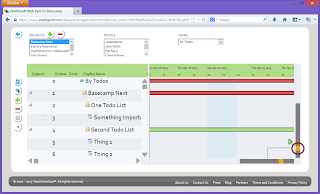
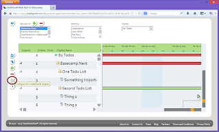
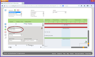
Finally, we noticed lots of space in the Gantt Chart when the vertical slider is down a ways. So we put in an option to show fields from your tasks right in the Gantt. You choose the fields, we display them with the task. On the left had side of the chart we click the 'Configure' button that brings up our options:

We can put 'Display Name' in the first slot:

And maybe the Due Date in the second slot:

We think the result is a Gantt Chart that can scale both to your timescale needs and to your eyeball needs.

Thursday, April 11, 2013

IntelliGantt Running on Platforms and Devices

You purchased your computing device. We see no problem with wanting to use it. So we made our next generation of IntelliGantt at home just about everywhere. Thanks to HTML5 (already supported by the latest web browsers) and Javascript (an ECMA standard today), the vision has become reality. The best part is 'no compromise' computing: In-place editing, drag and drop animations, network communication features are all supported. In fact, the main user interaction issue we had to confront was the brave new world of touch interfaces (also supported!)

But enough talking (writing?), let's see what it looks like running on all these different things.

Here is a screenshot of IntelliGantt running within Internet Explorer 10 (IE 9 is also supported). Microsoft did a very nice job with Internet Explorer 10-- we really didn't have to change a thing.

Next up is Chrome. Google did a nice job with the latest Chrome-- we really didn't have to change a thing.

Next up is Firefox. Mozilla did a nice job with the latest Firefox-- we really didn't have to change a thing.

Next up is Safari on Mac OS. Apple did a nice job with the latest Safari-- we really didn't have to change a thing.

Next up is the iPad. Apple did a nice job with the latest iPad-- we really didn't have to change a thing.

Finally, we have a Google Nexus 7. Google did a nice job with the latest Nexus-- we really didn't have to change a thing.

The only downside is our test lab is filled with all sorts of computing devices. But no one is really complaining.

Tuesday, April 09, 2013

The Next Generation of Project Visualizations

We've taken a look at the landscape these days and are really enjoying the changes. It used to be you'd select one platform (Windows) and create your product. Now you have a whole host of platforms to choose from, each with astonishing growth rates, developer stories and potential. The trick is to pick the one best suited for your customers as well as for your own needs. Our bet? HTML5+Javascript.

Yes, we remember well the days of client side Java and the ability to 'write once and run anywhere' (which of course became 'write once, debug everywhere'). However, you have to evaluate each opportunity with a fresh viewpoint and, given the current state of HTML5, Javascript, the fragmentation of Android, the ceiling of iOS and the backwaters of 'Others', the only common facility among them all is the ability consume rich web pages. So, we are going for it.

In the coming weeks we will unveil the next generation of our gantt chart visualizations. In addition to many great new features (swimlane resources + tasks, resource support, vertical scaling, in-gantt editing and more), we will also showcase broad platform support by showing it on Windows, Mac, iPad, Google Nexus; within Internet Explorer, Chrome and Firefox; by mouse and by touch.

Our first offering will be with 37 Signals Basecamp, to be followed soon by SharePoint and any other platform that supports web services.

These are exciting times and we look forward to working on the next generation with you.